Large images are one of the most common reasons a blog page feels slow. A photo straight from a camera or design export may be many times larger than the space where it appears on the page. This matters for bloggers, website owners, and editors preparing images for publication because small publishing decisions compound across a site over time.
The Core Idea
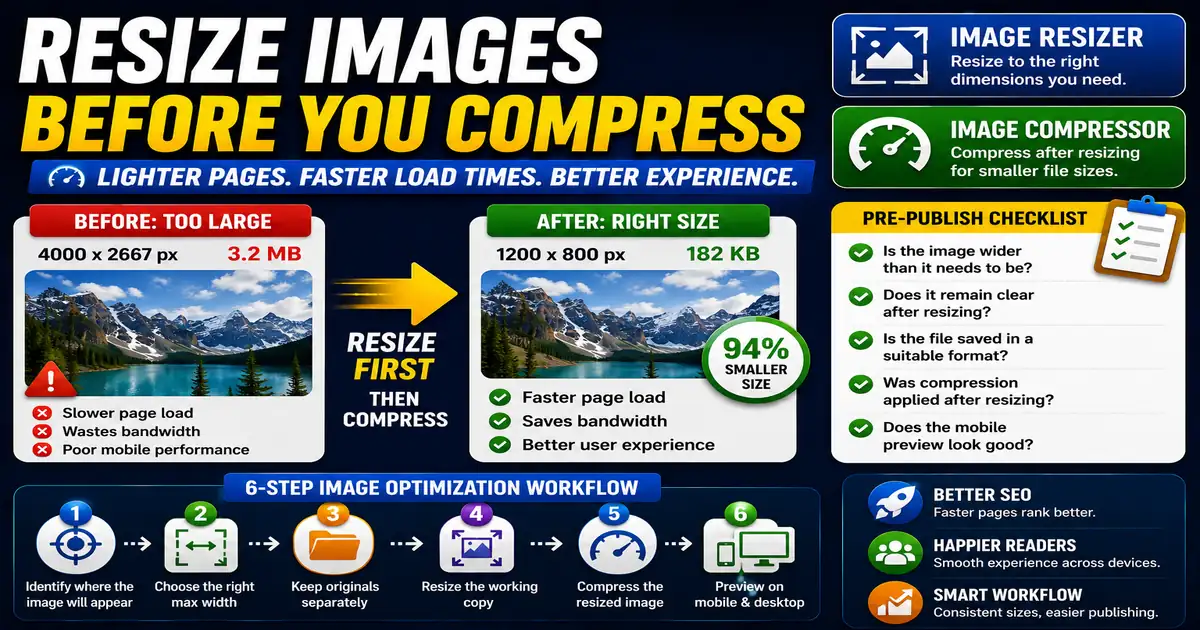
The core idea is simple: resize images to the dimensions they actually need before relying on compression or browser scaling. When this idea is applied consistently, the page feels more intentional and the publishing process becomes less dependent on memory or guesswork.
Why It Matters in Practice
A blog card thumbnail displayed at 600 pixels wide does not need a 4000-pixel source file. Resizing it first can reduce weight dramatically before compression even begins.
This is where local tools are useful. They give you a fast way to check one detail without opening a large application or sending your content through an external service. For a focused hands-on check, use the Image Resizer and Image Compressor while reviewing the page.
A Practical Step-by-Step Workflow
Think about image size as part of publishing, not as a technical chore after the page is slow.
- Identify where the image will appear.
- Choose a reasonable maximum width for that placement.
- Keep original files separately when needed.
- Resize the working copy before uploading.
- Compress the resized image.
- Preview the page on mobile and desktop.
This workflow can be added to a publishing checklist, a content brief, or a personal editing routine. The exact order may change from one project to another, but the habit of checking before publishing is what protects quality over time.
Practical Example
A featured image, a sidebar thumbnail, and a small related-post card do not need the same source dimensions. Preparing the right size for each placement keeps pages lighter.
Common Mistakes to Avoid
When optimizing this element in your drafts, review the final output carefully to avoid errors that compromise readability and search presentation. Watch for these specific mistakes:
- Uploading full-resolution photos for small thumbnails.
- Relying only on CSS to shrink images visually.
- Making every image the same dimensions regardless of placement.
- Forgetting high-density screens entirely.
- Cropping important details from instructional images.
Pre-Publish Checklist
Review this focused checklist before publishing your work to ensure all details are correct:
- Check the maximum width of your blog content container.
- Scale images down to display dimensions before uploading.
- Preserve original aspect ratios to prevent distortion.
- Add height and width attributes to prevent layout shifts.
A Small Workflow Tip
Keep a few standard image sizes for common placements such as hero images, article cards, sidebar thumbnails, and inline screenshots. Writers and editors do not need to reinvent dimensions every time. Standard sizes also make the design feel calmer because images crop and align predictably across the blog, tools page, and related content sections.